MITSUBISHI AUSTRALIA
Transforming Mitsubishi's car configurator.
I was the lead designer (UX & UI) on a project for Mitsubishi Australia, where we were tasked with overhauling the existing car configurator, starting with the Triton.
INDUSTRY
Automotive
MY ROLE
Lead UX/UI Designer
MY KEY ACTIVITIES
Owned end-to-end design—from discovery through to handover & QA, client comms and design project management.
THE CHALLENGE
We redesigned Mitsubishi Australia’s Triton configurator with 3D/AR, smart logic, and a clearer accessories experience.
Built within the existing system, the solution scales across models and reduces configuration friction.
Project goals included:
- Engagement: Enable users to truly “see” their dream Triton via 3D/AR.
- Logic: Prevent impossible configurations (e.g. incompatible accessories, colour clashes) without frustrating errors.
- Discovery: Make a huge library of accessories and accessory packs easy to browse and understand—especially on mobile.
- Constraints: Work within the existing configurator’s structure and design system limits.
THE APPROACH
Deep Discovery
This project involved extensive research and discovery to ensure we were set up for success. As a team we mapped all vehicle-configuration rules via workshops to understand configuration logic and constraints. I also audited competitor configurators to surface proven interaction patterns.
Mobile-First UX & UI
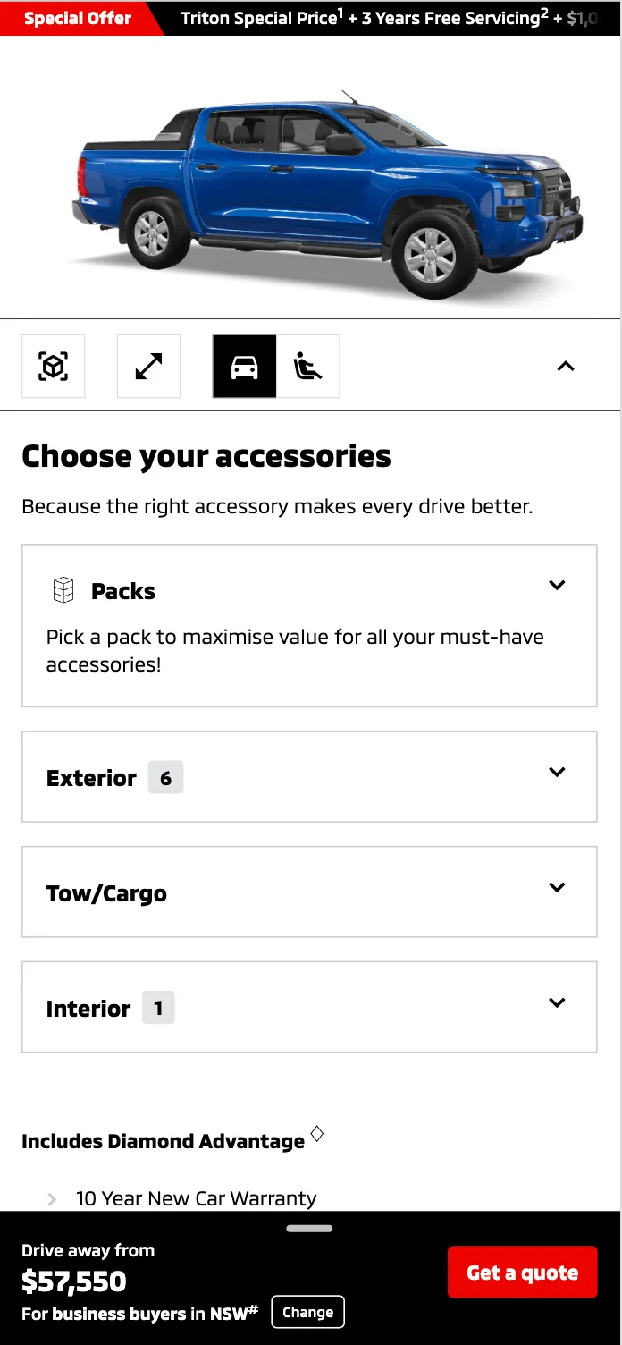
We wireframed and then completed UI design for all elements of this project. Key sections included:
- Screen size appropriate layouts for the 3D visualiser, for example on mobile offering a sticky, minimised and full-screen 3D viewer that users could expand/minimise.
- Designed intuitive “fail” scenarios – inline messages & multiple decision-modal flows that clearly explained next steps.
- Accessories overhaul - Differentiated individual items vs. accessory packs; card-based accessory tile designs with modal deep dives for details/variants; clear selection of accessories and variations.
Design system updates
Key design system updates were made at the end of the project to ensure the design system remains in line with latest designs. This work included creation of all new components as part of this project and updating existing components that had been updated (e.g. improvements to accessibility of some components).
QA & handover
Finally I conducted design QA and assisted the development team with handover and questions throughout the project.
THE SOLUTION
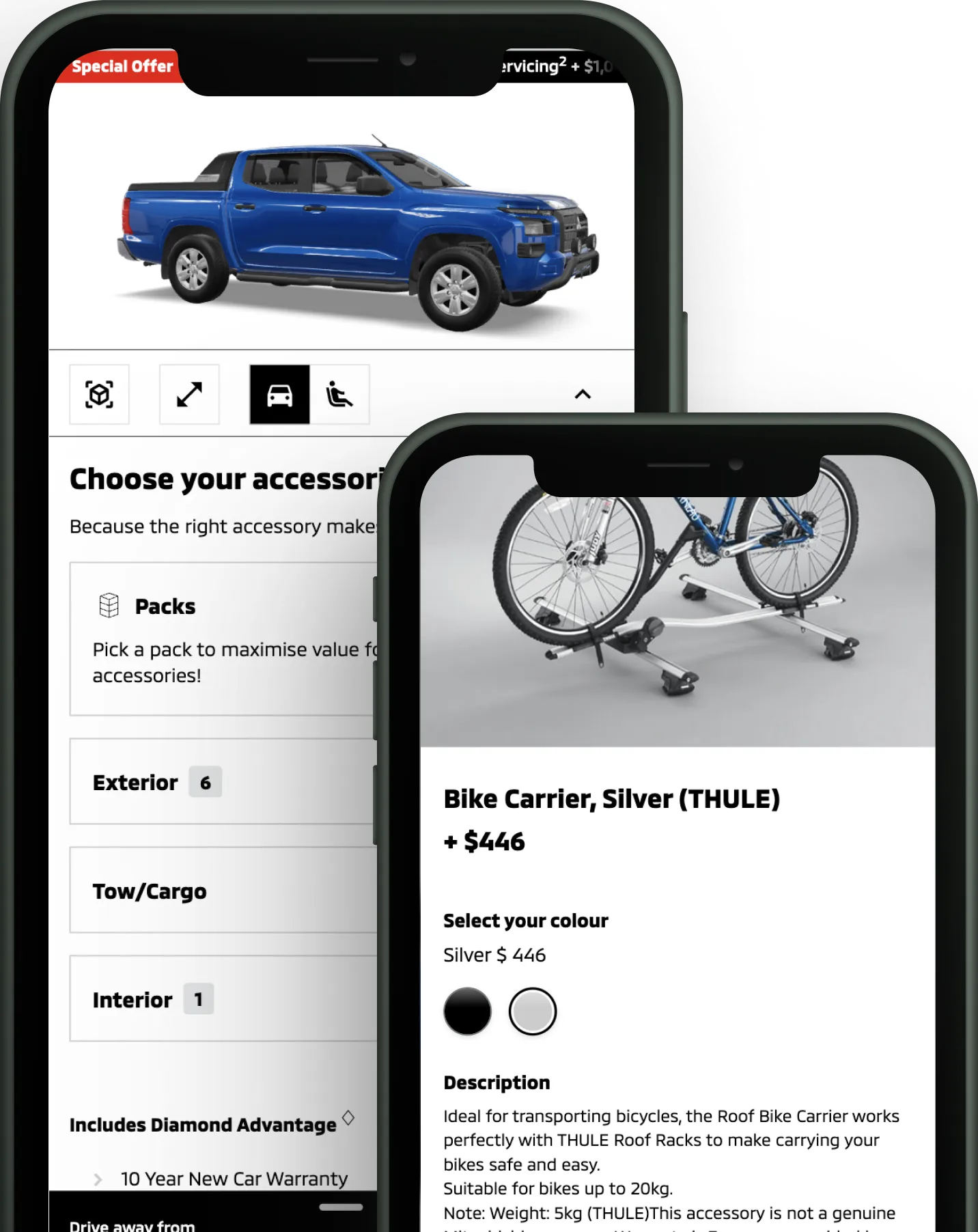
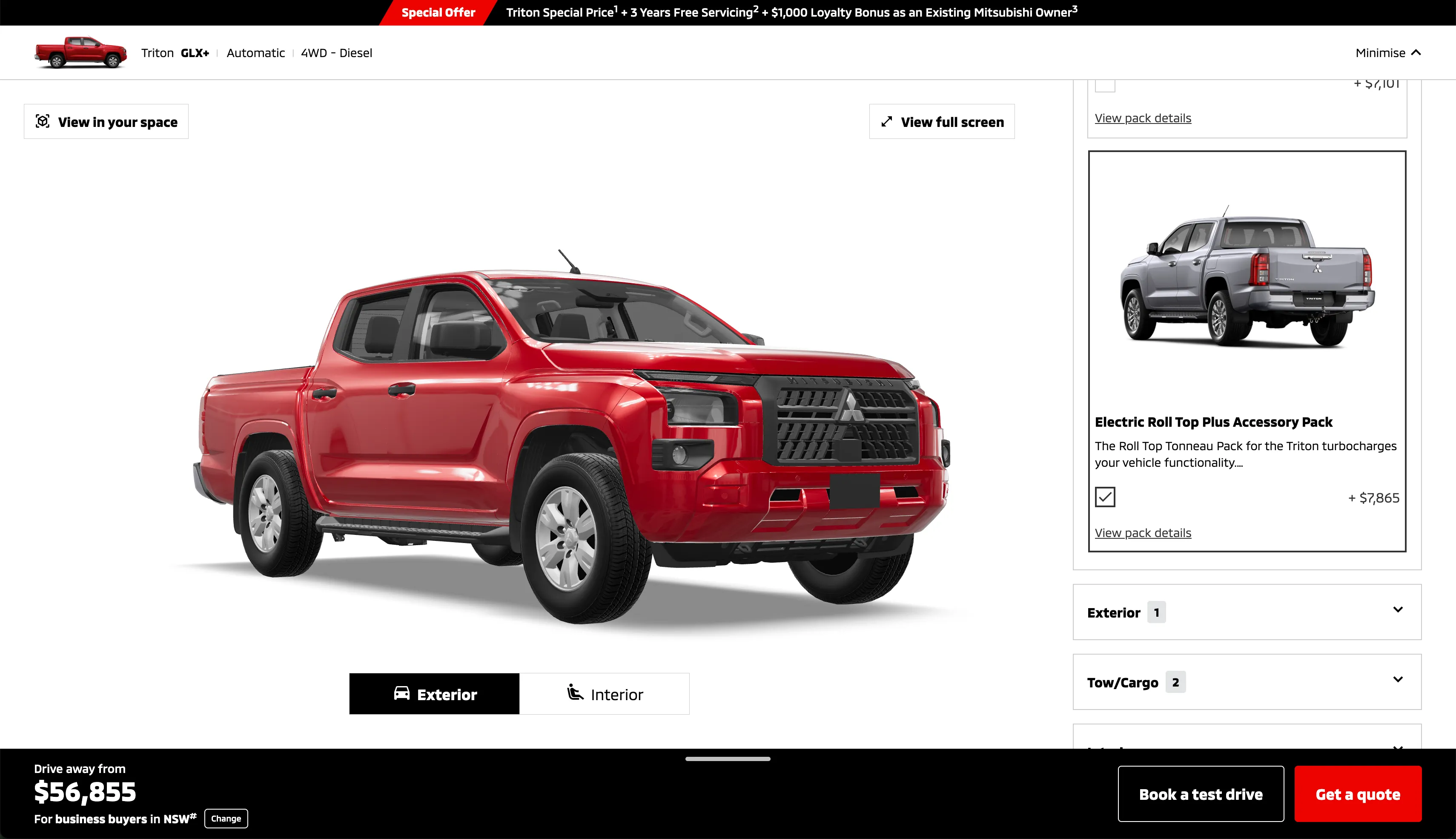
Adding a 3D visualiser and AR functionality for maximum engagement
- Realtime updates: Seamlessly updates in real time as users make selections. The sticky positioning of the 3D visualiser at the top of screen allows user to immediately see what their car looks like with any new selection.
- Full control over available screen height: Mobile controls allow quick minimise/expand of the 3D visualiser. Key selection details remain visible to the user when the 3D visualiser is minimmised, to ensure user has context of their selection at all times.
- Seamless transitions: As the user scrolls down the page the visualiser transitions from in-place display to sticky view, seamlessly maintaining positioning of all visualiser actions with the minimise action disabled/enabled between states as required.
- Clear interactions with the 3D & AR experience: User can access all relevant controls to view interior/exterior view, launch in AR, understand when visualiser is loading etc.
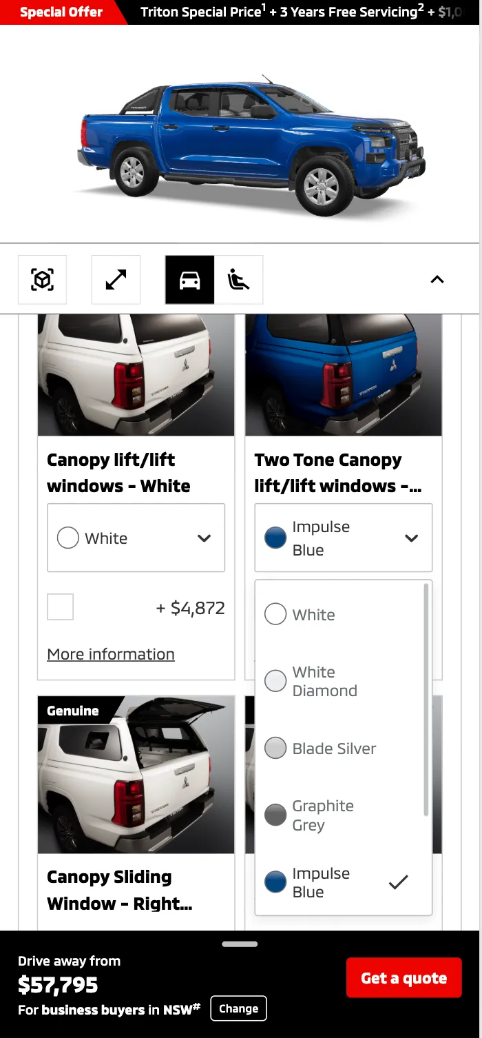
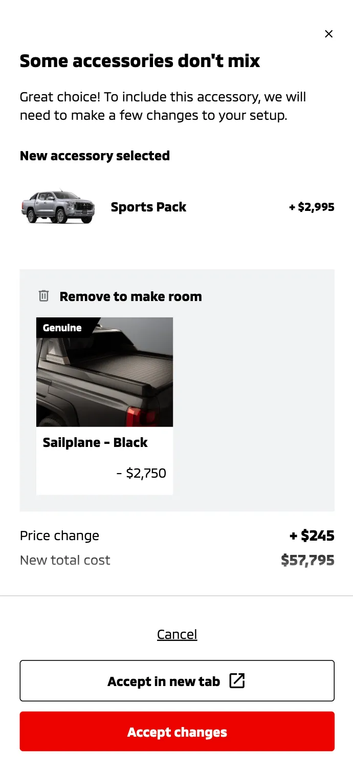
Robust compatibility logic
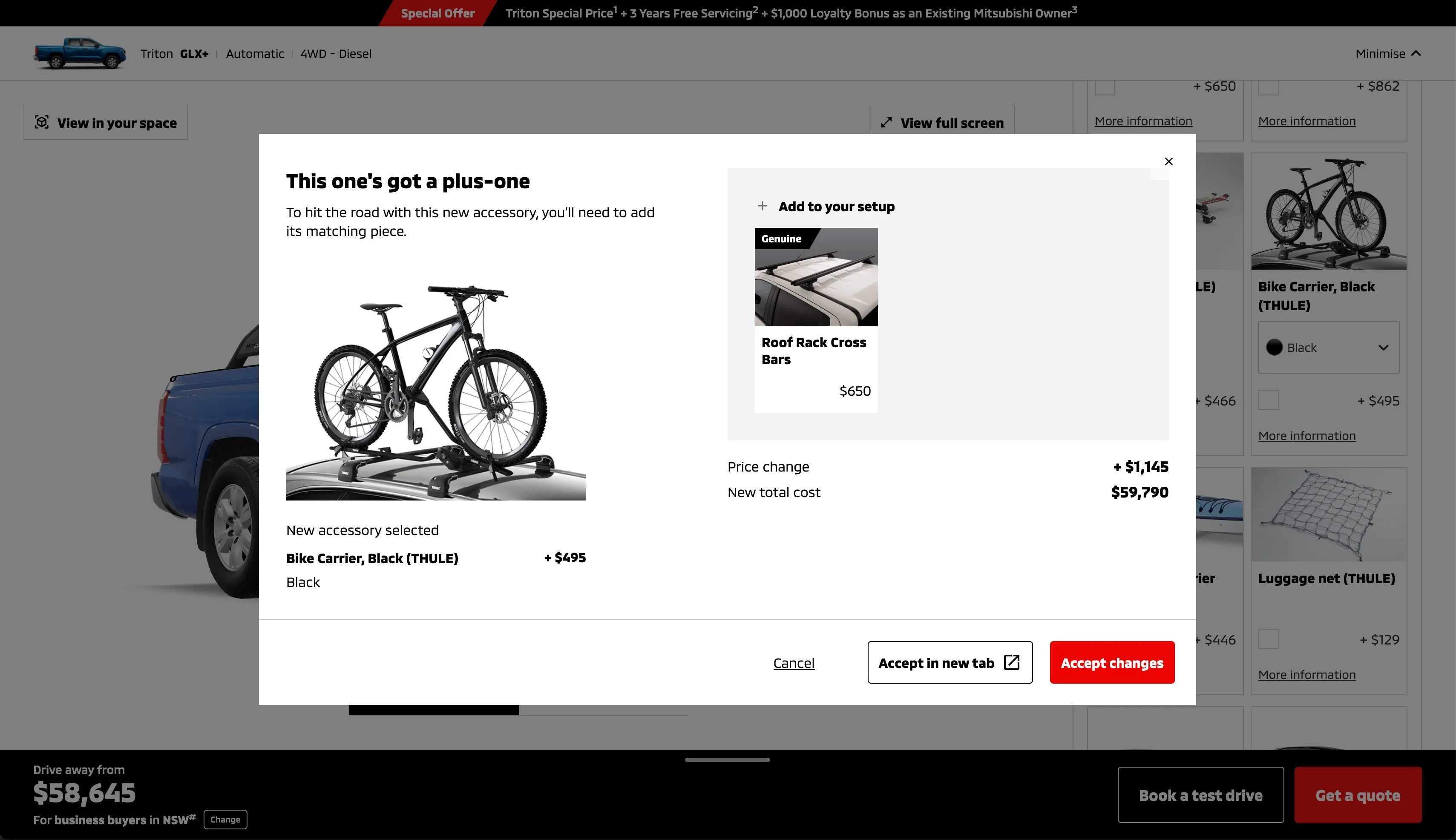
- Decision modals: Automatic checks prevent invalid builds and multiple variations of decision modals guide users to clearly understand the issue, resolve conflicts or compare configurations.
- Colour-swap modal: Ensures selected accessories always match the chosen vehicle paint for optimal car configuration.
- UX copy: All UX copy was crafted to ensure clear and friendly communication.
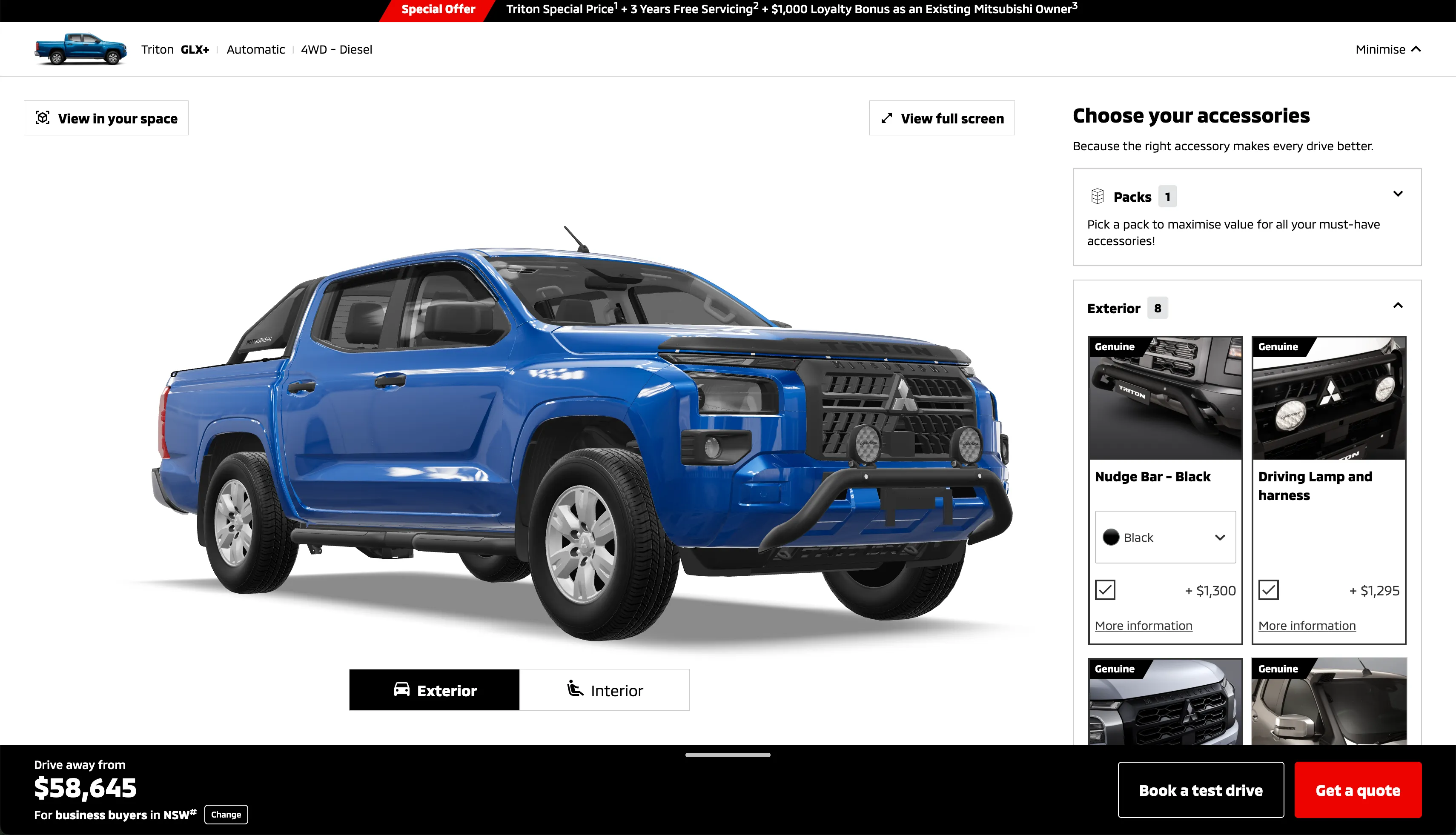
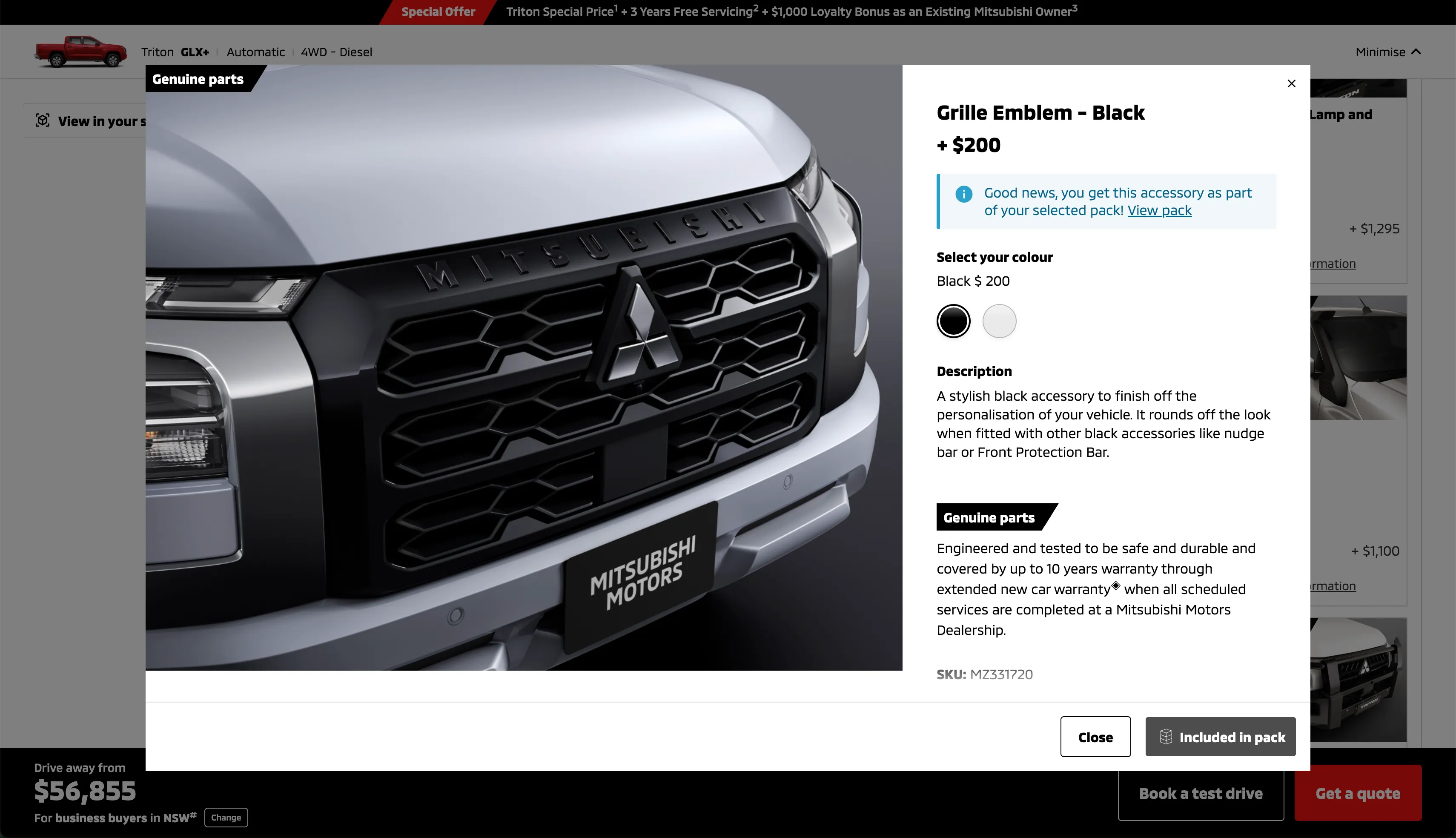
Making accessories easily discoverable and compelling
- Mobile-optimised display: Rebuilt the grid layout for fast, thumb-friendly browsing—cards resize and reorganize dynamically to fit any screen.
- Pack presentation: Curated “bundle” cards spotlighting curated accessory packs with clear value propositions, helping users discover key collections at a glance.
- Accessory information: Accessory tiles have been designed to enable quick access to key info, pricing, and variant options. User can easily select variant option and add/remove accessory from build in a single click. Or click to view more information if required.
- Selection clarity: Introduced clear visual states to indicate when an item is selected—whether standalone or part of a pack—to eliminate confusion.
- In-context detail modals: Enabled tap-to-open modals that surface full specs, pricing, and variant options; users can switch colours and add the accessory to the build from the modal also for a seamless experience.
- Effortless add/remove logic: Simplified toggles and incremental controls allow users to adjust quantities or remove accessories directly from both the card grid and inside the detail modal, ensuring seamless updates to their build.
OUTCOMES
What did we achieve?
This project has been extremely well received with all stakeholders at Mitsubishi Australia and they have received fantastic initial user feedback. The redesign delivered:
- Triton configurator launch (live July 2025): First model to go live with the new experience; subsequent models in progress.
- Enhanced engagement: Early user feedback highlights the intuitive 3D/AR preview as a key differentiator.
- Reduced configuration errors: “Fail” scenarios now resolve in-flow, boosting user confidence and lowering support inquiries.
- Successful accessory redesign: Efficient discovery and selection of all accessory types, increasing configured car value.
OTHER WORK
Developing the Screen industry in NSW
I led the UX phases of a larger project to completely rethink our client's website. We needed to engage diverse stakeholders in the Screen industry with unique needs & challenges, in order to better promote the client's offering.
View case study →